Monday, January 8, 2007

feng shui part 1:

The more you read about it, the more curious you become. The principles of Feng Shui can be complex, but are actually quite logical with a common sense approach to them. I won’t go so far as to say it’s simple, but it is intriguing.

We recently relocated to Taiwan, upon our arrival we began to experience how real the concept of Feng Shui is for the people and its culture.

The Hotel where we stayed was the first example of feng shui we encountered, the Hyatt Hotel, is an enormous, beautiful hotel; it was built on top of a former wartime execution ground and cemetery and is said to be haunted. You can just imagine the amount of Feng Shui needed to make this property worthy of such an investment as well as acceptable to the community and to be prosperous.

One thing I’ve learned is that the Taiwanese people are very superstitious so I’m certain there’s a very interesting story about how this was achieved. You got it; this is definitely a story worthy of an indepth article…..and I will get back with you when I can dig up more information.

The second encounter was Taipei 101, this building is located right next to the hotel and is the tallest building in the world. A Feng Shui Master was consulted in every aspect from location, construction, to layout and design elements.


The buildings design is inspired by traditional Chinese architecture, with a shape resembling a pagoda. The sectioned tower was inspired by the bamboo plant, which is a model of strength, resilience, and elegance. (I think it looks more like Chinese take out boxes stacked one on top of the other…but that’s just me)

The tower's design specifications were said to be based on the number "8", a lucky number in traditional Chinese culture because it rhymes with the sound of money; and features 8 upward flaring sections, and is supported by 8 super columns.

Posted by Picasa


The tower is sheathed by a wall of green tinted glass and grows upwards like a plant reaching for the sky and is embellished with traditional Chinese symbols; spoon-like figures which signify fulfillment and contentment as well as round coin like circles and lotus flower designs. The building is also south facing, which is considered a very auspicious direction for this buildings orientation. (auspicious, thats another word you hear alot in Taiwan)

The only feng shui problem found was a perpendicular road that ran straight into the building's site, which could bring sickness or bad business to occupants; an easy fix was adding a fountain to block off the road. The fountain, as it turns out, is one of the coolest I've seen, it's made up of numerous holes in the pavement spurting water while keeping the beat with music. At night the fountain features lighting for a more dramatic effect; its quite spectacular.

Fortunately for everyone, in feng shui there are simple ways to rectify defects, even if the defects are in the terrain.

The last experience I had was moving into our newly constructed apartment-we were the first to move into the building. The owner was so proud of the unit that on our first day of moving in with a dozen workers unloading the containers, wood crates being unhinged and boxes everywhere; he was conducting tours. My favorite was when he brought his father through and he commented and it was translated to us, that with the mountain behind us and the direction of the building we would be happy and rich…..sounds good to me, but I'm still waiting!

Feng shui has been part of the Taiwanese culture since 1949 when General Chiang Kai-Shek fled China to Taiwan and brought several old feng shui texts. Since then it has been incorporated into the interior and exterior of buildings at both the workplace and homes, so that people are healthy and feel lucky.


Look for a continuation of this article....
www.kellciadesigns.googlepage.com/home

Saturday, January 6, 2007

color trends 2007

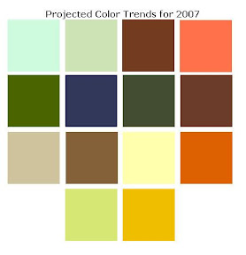
Colors from Left to Right, reading side to side:
Sea Kilt-a fresh blue-green inspired by the sea; cool, youthful interiors will embrace this new young color.
Valor-a darker version of the above with a smoother feel that lowers your temperature just looking at it
Godiva-rich chocolatey goodness is one of the foundation colors for 2007; harmony is created by complementing corals, botanical greens, deep pinks and aquas with in the home setting.
Dawn Sky-a softer version of the deeper toned "Coralite" in the contract palette.
Spruce It-soft and warm, a deeper green; another foundation color, warm neutrals pair nicely to produce a relaxing restful space.
Aegean-the most vibrant of the 2007 colors, liquid and calming, a true luxury color.
Stratus-a mid-toned neutral that blends easily with gray, brow and purple; complex yet soothing.
Claret-deep and full bodied with cool undertones that screams luxury. Pared with neutrals, warm golds or botanicals greens, its the bridge to harmonizing your space.
Regale-shimmering soft metallic, elegent, this muted tone has a touch of purple.
Cinnamon Glaze-warm mid-tone with strong influences of red, the visual effect is rich and sweet creating visual fulfillment.
Vanilla Creme-a touch of yellow, this color will be everywhere to balance out the deeper tones of 2007; a big winner, mark my word!
Pennywise-soft and calmer than 2006 its a global color, this color brings warmth, hope and optimism, whether used matt or metalic.
Iced Citron-organic and restful with rejuvenation qualities softer than seen in 2006.
Positano-forecasted to debut in 2006 finally to fulfill its destiny. Sunny golden and deep, reflecting inspiration-sun drenched Positano on Italy's Arnalfi Coast

www.kellciadesigns.googlepages.com/home

Posted by Picasa

Thursday, January 4, 2007

Getting Started...

Getting started seems to be the hardest part; what to do first? There are so many possibilities so I'll start with what's in my head at the moment: Color.

Yes, I said it, Color! Don't you often find your mind wandering to what the color trends will be for the new year? I imagine you do if you're reading this blog since I'm certain you have a keen interest in the world of design.

I've always wondered who picks out the new colors for each year, do they just pick colors that haven't been seen for a while in an effort to rotate them back into style or invent new ones? ....Or do they just assign new catchy names to those old rotating colors?


You know what I'm talking about, off the top of my head I can think of half a dozen fluff names used to describe the range of greens out there right now. I'd love to have the time to sit down and match the mixing codes to see how many are actually the same color but given a new name; that could be a full time job for someone seeking work out there, dont you think?

If you think about it, those people making these decisions have a lot of influence in the world because color trends affect everything from fashion to fabrics, carpets, paint, accessories, appliance design, cars, shoes... I could go on, but I think you get the picture!

An article I recently read said that people tend to seek comfort colors for their personal spaces during times of uncertainty and global discord and that natural materials become more popular during stressful times.....that explains the last few years of my life! I guess there are worse things I could be doing, don't you think?

Back to color, ahem, color trends for 2007 are clearly showing a need for calm in personal spaces to balance the negatives of everyday life. In 2006 colors were slightly brighter than what enters the market in 2007; the new trends are defined as comfort colors with optimistic lights and brights, with patterns and textures (natural or faux) becoming as prominent as color itself.


These colors are from the 2007 projections


If you want to read more about color, one of my all time favorite sites is pantone, check it out and get lost in time if you want.

Until next time, keep dreaming in color!!
www.kellciadesigns.googlepages.com/home


Interior Design is the art of arranging everyday things, beautifully.” --Kelly Garcia

Blogarama Arts Blogs - Blog Top Sites